BRAND DEVELOPMENT
THE POTATO SACK
BRAND DEVELOPMENT APPLICATION ADverTISING
It is said that a good designer can re-brand and upscale almost everything… Here you have a triumphant makeover of the potato sack, a new fashion trend which evolved from being a symbol of frugality and simple country life to the sophisticated brand of luxury goods for modern urban dwellers with self-irony and love for everything authentic and true-to-nature.
This branding project is a celebration of my design abilities. It demonstrates the varied skills I possess, from copywriting the brand’s philosophy, to researching the almost 100-year-old history behind the potato sack dress, to drawing the coat of arms and hand-printing the pattern, to designing the logo, on-line presence, finalizing the Potato Sack identity in the brand book, and to crafting the final products and packaging.
PRODUCT DESIGN
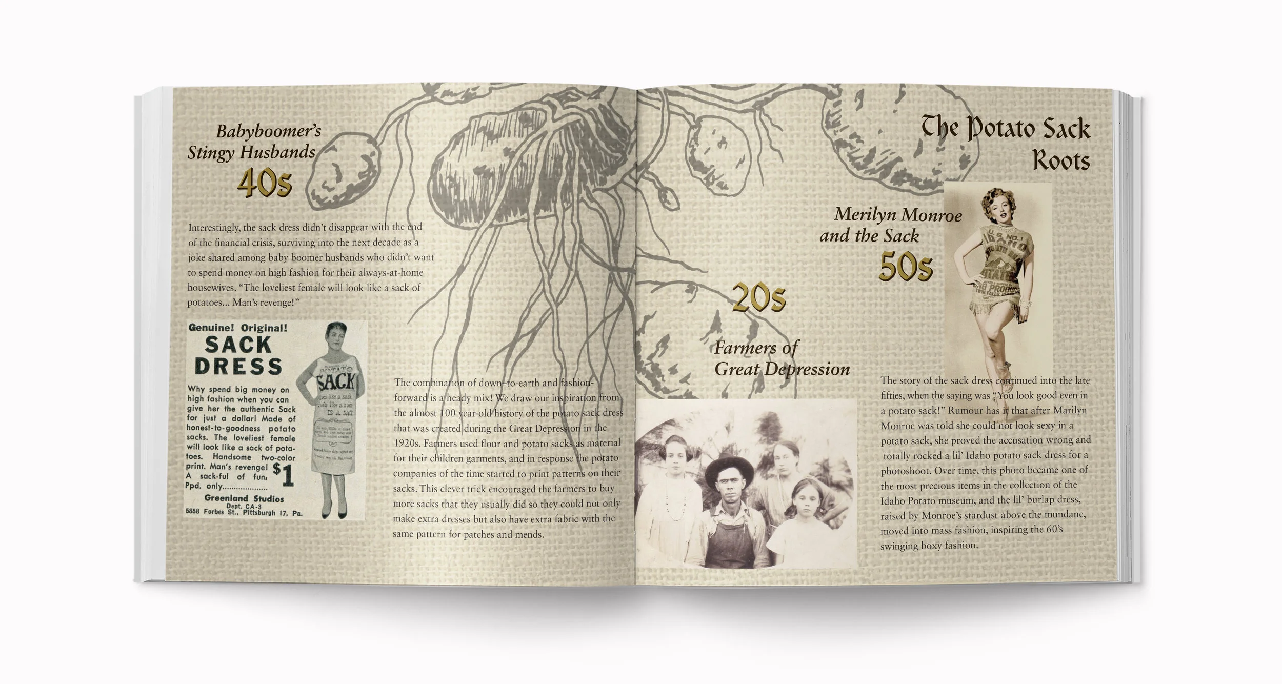
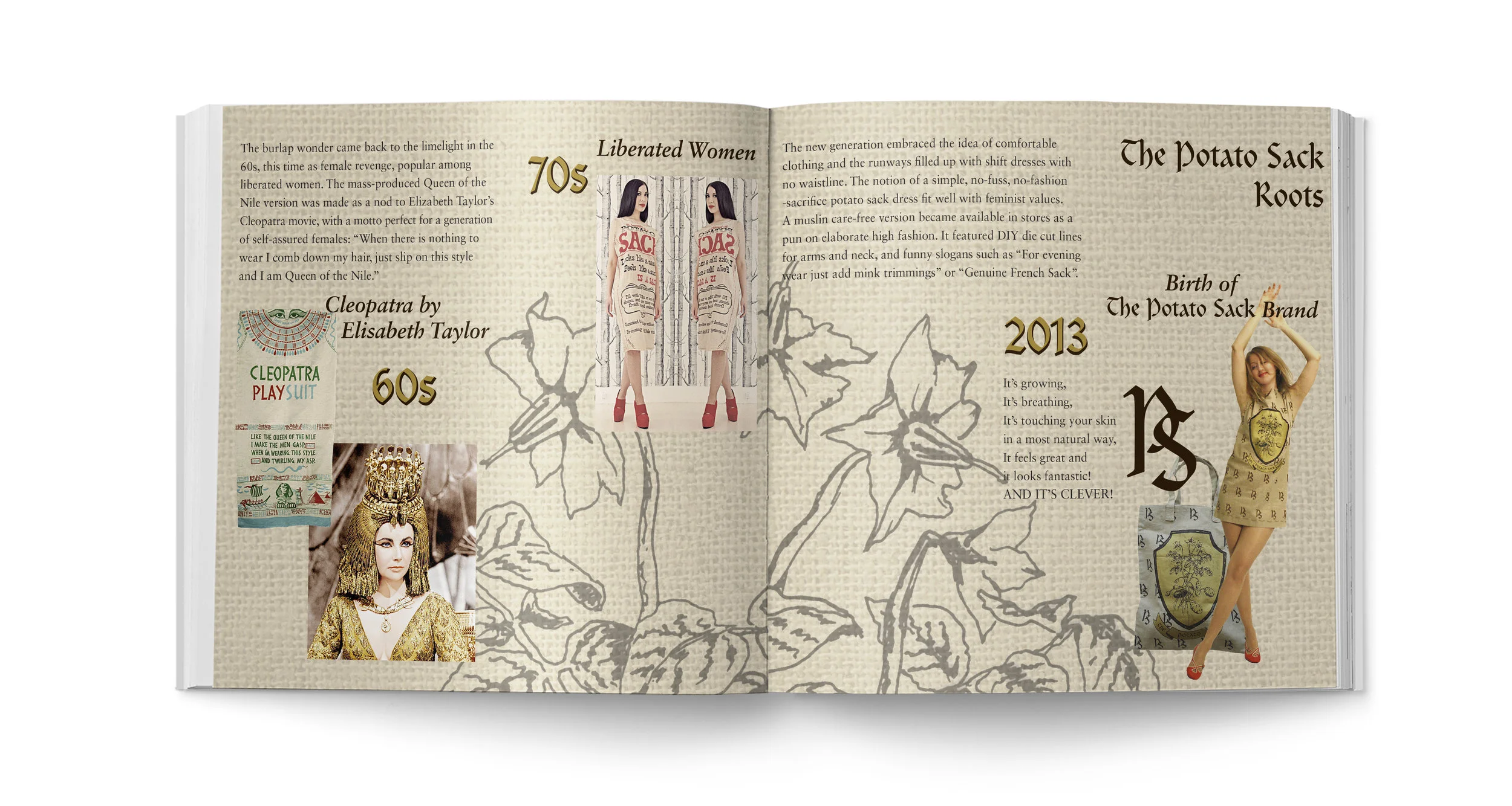
Every Potato Sack bag reflects the brand's heritage, showcasing in a screenprinted format the varies incarnations of the potato sack over the past century, which I had to research in depth for this project. Marilyn Monroe and the Man’s Revenge ad, Cleopatra Playsuit and the faded-away image of pioneer farmers, historical potato bags prints and my own coat of arms, the bags represent quaint story behind the brand, with the name that says it all: it is just a potato sack… with a bit of a twist!
brand book
The concept of the brand, its history, and the elements of its identity were explained and visualized in the book. To keep it cohesive with the texture of the products, the hardcover was screenpinted on fabric. All illustrations, collages and graphics were created by me.
ADverTISING
A number of typographical posters were developed that bear the trademark typeface and logo of the Potato Sack brand. To unify the entire advertising campaign under one idea, “Belong to the circle of urban dwellers”, i.e. a “club” of cool owners of the Potato Sack, I also created promotional editorial posters that were screenprinted by hand.
The editorial posters are all based on the ironic metaphor of the brand: upscaling a mere potato sack and turning it into an object of desire. I appropriated existing high-end fashion images and added a twist: the original luxury goods were replaced with Potato Sack products, bringing into life the motto “There is a true potato sack in everyone.” The posters were split into CMYK layers and screenprinted on professional lightly-coloured paper in order to give them more down-to-earth, hand-made look.
WEB & MOBILE UX DESIGN
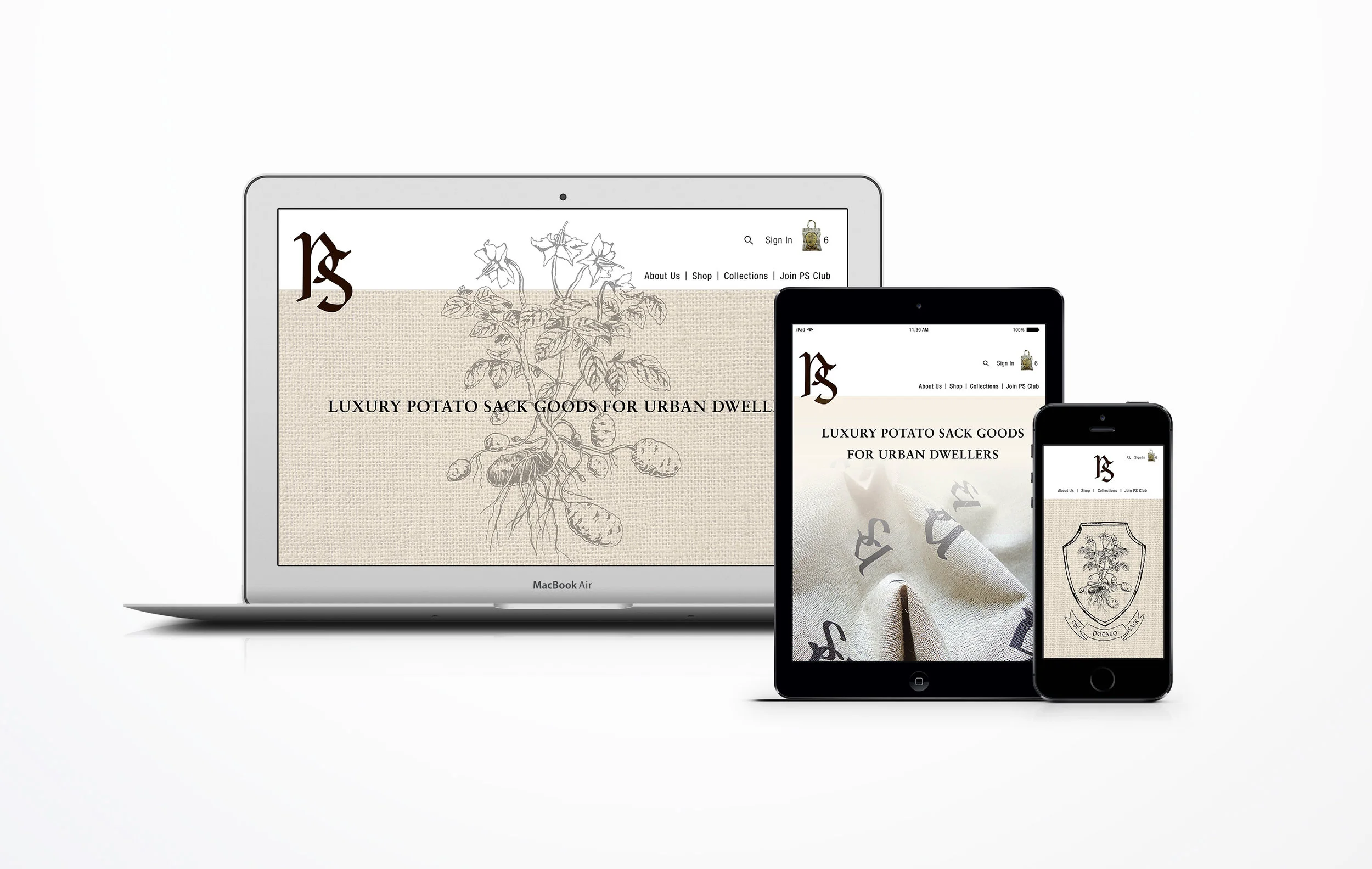
The Potato Sack branding is complete with web and mobile UX design.


